Typography quietly shapes how people experience your brand long before they read a single word. Every email, presentation, landing page, proposal, and internal document relies on type to communicate meaning, credibility, and intent. Yet for many organizations, corporate font decisions still happen based on preference rather than performance.
Most brand, marketing, and design professionals can instinctively spot a font that feels wrong. A playful handwritten typeface does not belong in a legal document. A default system font rarely supports a distinctive brand identity. But choosing a font that simply looks good is no longer enough.
Corporate fonts must work across screens, devices, languages, and teams. They must load quickly, remain readable for diverse audiences, and stay consistent even when hundreds of people are creating content at once. This article breaks down five data backed criteria that help brands choose or design corporate fonts that truly perform.
Why Corporate Fonts Play a Bigger Role in Brand Performance Than Most Teams Realize
Corporate fonts influence how people recognize, trust, and engage with your brand long before they process your message. When typography is treated as a strategic asset instead of a design detail, it becomes a powerful driver of brand performance.
Typography as a Silent Brand Ambassador
Most brand communication happens through text. Long before users process messaging, they subconsciously register how that message looks and feels. Typography influences whether content appears professional, approachable, authoritative, or careless.
A corporate font becomes a silent ambassador for the brand. When used consistently, it creates familiarity. When used carelessly, it creates doubt. This effect compounds over time as audiences repeatedly encounter the same visual signals across touchpoints.
The Link Between Consistent Typography and Brand Recognition
Consistency builds memory. Research shows that consistent use of visual elements like typography significantly improves brand recognition. When audiences see the same typeface repeatedly across websites, documents, and marketing assets, the font becomes part of the brand’s mental shortcut.
This is why iconic brands remain recognizable even when logos are removed. Typography carries identity on its own. Over time, that recognition reduces friction and increases recall, especially in crowded markets.
How Typography Influences Trust and Perceived Quality
Trust judgments happen quickly. Studies show that people form opinions about credibility based on visual design before engaging with content. Typography plays a central role in this evaluation.
Clean, readable fonts signal clarity and professionalism. Inconsistent or poorly chosen fonts signal disorganization and lack of attention to detail. For brands selling complex, high value, or regulated products, this perception can directly influence buying decisions.
Typography Impact on Engagement and Conversion
Readability affects how long people stay, how much they read, and whether they take action. Fonts that strain the eye or slow page load times increase bounce rates and reduce engagement.
Typography choices also influence scanning behavior. Clear hierarchy, spacing, and rhythm help users find what matters quickly. That efficiency improves comprehension and conversion without changing a single word of copy.
What Makes a Corporate Font Right in 2026 and Beyond
The right corporate font is not defined by trendiness or popularity. It is defined by how well it supports your brand across real world conditions.

A strong corporate font must be inclusive, performant, scalable, and manageable. It must work for marketing teams, legal teams, sales teams, and executives alike. It must survive platform changes, global expansion, and increased content velocity.
The following five criteria focus on what actually matters when fonts move from design files into daily use.
Tip 1: Build Accessibility into Typography from Day One
Accessibility is often treated as a technical requirement or compliance task. In reality, it is a core brand responsibility. Typography that excludes people also excludes opportunity.
Roughly 15 % of the global population lives with some form of disability. Many more experience temporary or situational impairments, from screen glare to eye strain. Fonts that ignore these realities limit reach and weaken brand perception.
Why accessibility strengthens brand trust
Accessible typography signals care, professionalism, and inclusivity. It ensures that content is usable by the widest possible audience without special effort. Brands that prioritize accessibility demonstrate respect for their users, which directly supports trust and loyalty.
Letterform clarity and character distinction
Accessible fonts feature clearly distinguishable characters. Confusing letterforms such as lowercase l and uppercase I, or O and zero, increase cognitive load and error rates. Clear shapes reduce misreading, especially in long form content and data heavy documents.
Spacing and rhythm for comfortable reading
Generous letter spacing and consistent line height improve readability for all users. Tight kerning and compressed lines may look sleek in mockups but quickly become exhausting in real use.
Good typography allows the eye to move naturally through text without effort. This benefits readers with dyslexia, visual impairments, and anyone reading on smaller screens.
Contrast and background pairing
Sufficient contrast between text and background is essential. Low contrast combinations reduce legibility and violate accessibility standards. Corporate fonts should be tested across light and dark backgrounds to ensure consistent clarity.
Sizing standards across platforms
Small text undermines accessibility. Body text should remain readable across devices without forcing users to zoom. Fonts that lose clarity at smaller sizes are poor candidates for corporate systems.
Accessibility checklist for corporate fonts
Accessible fonts prioritize clarity over decoration, maintain strong contrast, scale cleanly across sizes, and remain legible under assistive technologies. These qualities should be tested before fonts are locked into brand systems.
Tip 2: Choose Fonts That Load Fast and Scale Across Digital Environments
Speed is part of brand experience. Users notice when websites feel slow, even if they cannot pinpoint the cause. Fonts are often an overlooked contributor to performance issues.
Page load time directly affects engagement, conversion, and search visibility. Fonts that are heavy, poorly optimized, or inconsistently loaded create friction before content even appears.
How font performance affects user behavior
Slow loading fonts delay content rendering and cause layout shifts. This creates frustration and increases abandonment, especially on mobile devices. Users expect pages to feel immediate. Typography should support that expectation, not undermine it.
Web optimized fonts versus decorative fonts
Fonts designed for print or display often perform poorly on the web. Web optimized fonts are engineered for clarity, efficient file sizes, and consistent rendering across browsers.
Choosing a font designed for digital use reduces the need for excessive adjustments and improves reliability across platforms.
File formats, compression, and subsetting
Modern font formats reduce file size without sacrificing quality. Subsetting removes unused characters, which significantly improves load times, especially for multilingual fonts.
Variable fonts further improve efficiency by bundling multiple weights and styles into a single file.
Managing font quantity and hierarchy
Using too many font families increases load time and visual noise. Most brands function best with one primary font and one supporting font. Clear hierarchy matters more than variety.
Performance checklist for corporate typography
Fast fonts load quickly, minimize layout shifts, support efficient formats, and require minimal overrides. Performance testing should be part of font selection, not an afterthought.
Tip 3: Select Fonts That Can Scale Across Languages and Markets
Even brands that operate primarily in one region rarely stay monolingual forever. Product expansion, global hiring, international customers, and regional partners all introduce new language requirements over time. A corporate font that cannot scale globally becomes a hidden bottleneck.
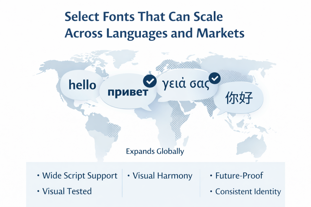
Typography that works in one language but breaks in another creates inconsistency, visual tension, and unnecessary work for teams trying to adapt layouts.
Why global readiness matters earlier than most teams expect?
Many brands wait until international expansion to think about multilingual typography. By then, the font decision is already embedded across systems, templates, and documents. Changing it becomes costly and disruptive.
Choosing a font with strong language support early creates flexibility. It allows brands to grow without redesigning their identity each time a new market is added.
Script coverage and character support
A globally capable font supports more than just basic Latin characters. It should include extended Latin sets, punctuation, symbols, and ideally additional scripts such as Cyrillic or Greek. For brands operating across Asia, Middle East, or India, broader script support becomes essential.
Fonts with incomplete coverage force teams to substitute fallback fonts, which immediately fractures visual consistency.
Maintaining visual harmony across languages
Not all fonts handle multiple scripts equally well. Some technically support multiple languages but look visually inconsistent when switching between them. Stroke weight, proportions, and rhythm should feel cohesive across scripts.
Strong corporate fonts maintain a recognizable personality even when the language changes.
Cultural sensitivity in typography
Typography communicates tone. A font that feels authoritative in one culture may feel rigid or unfriendly in another. While the core font remains consistent, it should be flexible enough to adapt without clashing with local expectations.
Testing typography in real content, not just sample phrases, helps surface these issues early.
Planning for future expansion
Global typography planning is not about predicting every market. It is about choosing a font system that does not limit future growth. Brands that plan ahead avoid costly redesigns and rushed compromises later.
Tip 4: Decide When a Custom Typeface Makes Strategic Sense
Bespoke fonts are often viewed as a luxury reserved for large brands. In reality, custom typefaces can be a strategic investment when differentiation, control, and long term efficiency matter.
The key is understanding when custom typography solves real problems rather than simply adding novelty.
What bespoke fonts actually solve
A custom font gives a brand complete ownership and control. It eliminates the risk of competitors using the same typeface and ensures that typography fully aligns with brand personality.
Custom fonts can be designed to support specific use cases, from multilingual layouts to dense data displays, improving both usability and consistency.
Differentiation versus recognizability
Popular fonts offer familiarity but also sameness. When many brands rely on the same typefaces, visual identity blurs together. A bespoke font creates a distinctive visual signature that audiences associate with your brand alone.
This differentiation compounds over time as the font becomes part of the brand’s memory structure.
Cost considerations and long term value
While custom fonts require upfront investment, they often eliminate ongoing licensing fees. For brands producing large volumes of content across teams and regions, this can result in long term cost savings.
Ownership also reduces legal complexity and compliance risks tied to font licensing.
Performance and optimization advantages
Custom fonts can be optimized specifically for how a brand operates. File sizes can be reduced. Unused characters can be removed. Rendering can be fine tuned for digital and print environments.
This level of control is rarely possible with off the shelf fonts.
When off the shelf fonts are still the right choice?
Not every brand needs a bespoke typeface. Smaller teams or early stage brands may benefit more from reliable, well tested fonts that are easy to deploy. The decision should be driven by scale, differentiation needs, and operational complexity.
Questions to ask before commissioning a custom font
Brands should consider whether typography is central to their identity, whether they need multilingual optimization, and whether they have systems in place to manage and distribute the font consistently.
Tip 5: Lock Typography into Everyday Workflows with Automation
Even the best font fails if it is not used consistently. Most typography issues do not come from bad design decisions. They come from manual execution.
Different teams, tools, and locations create endless opportunities for variation. Over time, inconsistency creeps in and weakens brand coherence.
Why brand inconsistency usually happens
People work fast, reuse old documents, substitute fonts when files are missing, and adjust spacing to fix layouts, often without realizing how these small decisions gradually erode brand consistency. These small decisions accumulate into visible brand drift.
Without guardrails, consistency relies on memory and discipline, which never scale.
Fonts beyond marketing assets
Corporate fonts live everywhere. They appear in proposals, reports, presentations, contracts, internal communications, and sales materials. If typography is not embedded into these workflows, brand control remains fragile.
Centralized font governance
Central management ensures that approved fonts, weights, and styles are always available and applied correctly. It removes guesswork and prevents outdated or incorrect usage.
Templates and locked styles
Templates enforce hierarchy, spacing, and font usage automatically. Teams can focus on content while typography stays consistent by default.
How automation reduces errors and review cycles?
When typography is automated, fewer errors reach review. Fewer fixes are needed. Content moves faster without sacrificing brand integrity.
This is where platforms like Brandy help brands manage fonts as part of a broader brand system, ensuring approved typography is accessible, current, and consistently applied across teams and tools.
Common Corporate Typography Mistakes to Avoid
Many brands repeat the same mistakes when selecting and managing fonts. Many brands choose fonts based on personal taste rather than real use cases, overlook licensing constraints, and rely too heavily on decorative styles that do not scale well across platforms or content types.
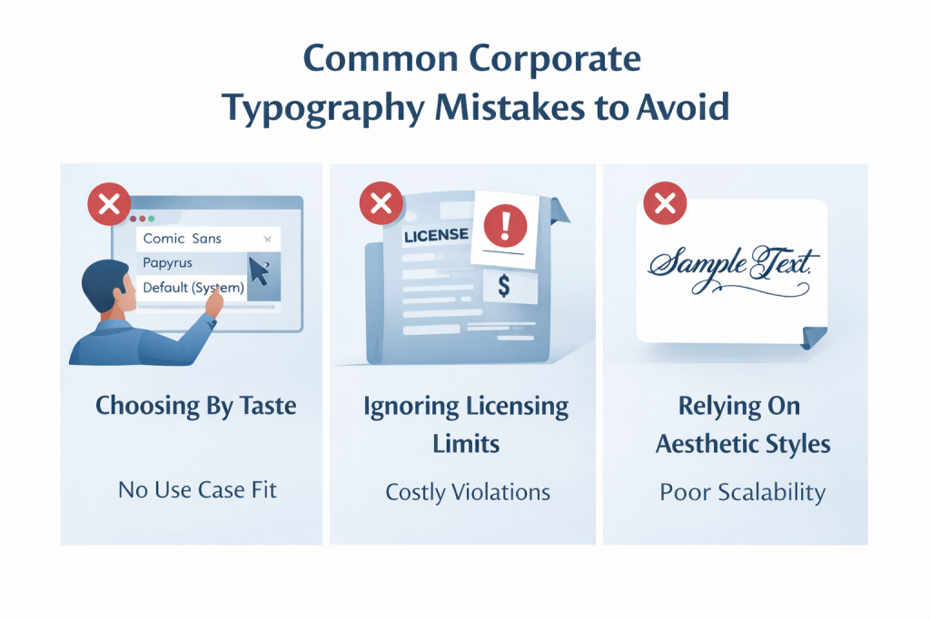
Others allow uncontrolled substitutions, leading to fragmentation over time. Treating fonts as static assets rather than living components of the brand system creates long term issues that are difficult to reverse.
How Strong Typography Supports Long Term Brand Consistency?
Typography is not isolated from brand strategy. It works alongside tone of voice, visual identity, and messaging. When aligned, it reinforces recognition and trust at every touchpoint.
Brands that measure typography success look beyond aesthetics. They track consistency, usability, efficiency, and perception over time.
Conclusion: Turn Your Corporate Font into a Scalable Brand Asset
Choosing the right corporate font is not about finding something that looks good today. It is about building a system that supports accessibility, performance, global growth, and consistency over time.
When typography is chosen with data and managed with the right tools, it becomes a durable brand asset rather than a recurring problem. Platforms like Brandy help teams centralize fonts, enforce usage, and keep brand expression consistent as organizations scale.
Typography may be silent, but when done right, its impact is unmistakable.