Nowadays brand guidelines are more of an afterthought. Here is how the spacing works, these are the brand colors and please for the love of god don’t place the logo on a messy background. 99% will fit the same template. A lengthy corporate document one rarely wants to look.
40 or 50 years ago this was not the case. Brand guidelines used to be beautiful pieces of work which carry the original vision and aesthetic of the author. A sign of an era where visual identities were crafted by world class artists.
Some of the examples below were published as a book years later. I’ve included links for the graphic design junkies who need these in their bookshelves.
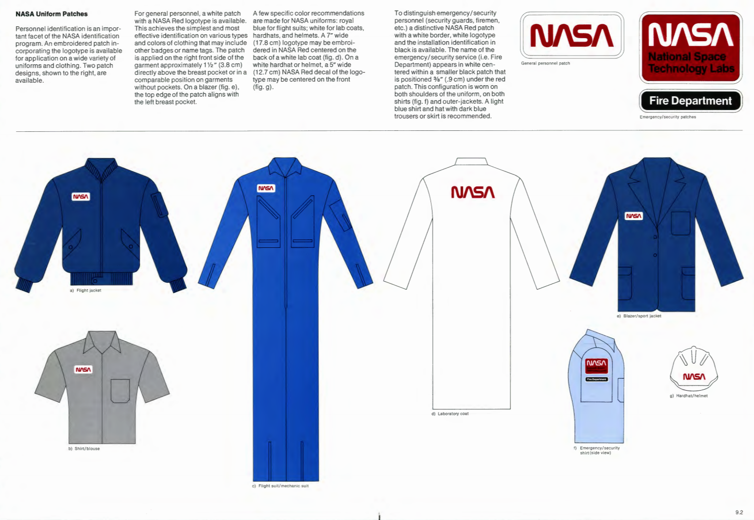
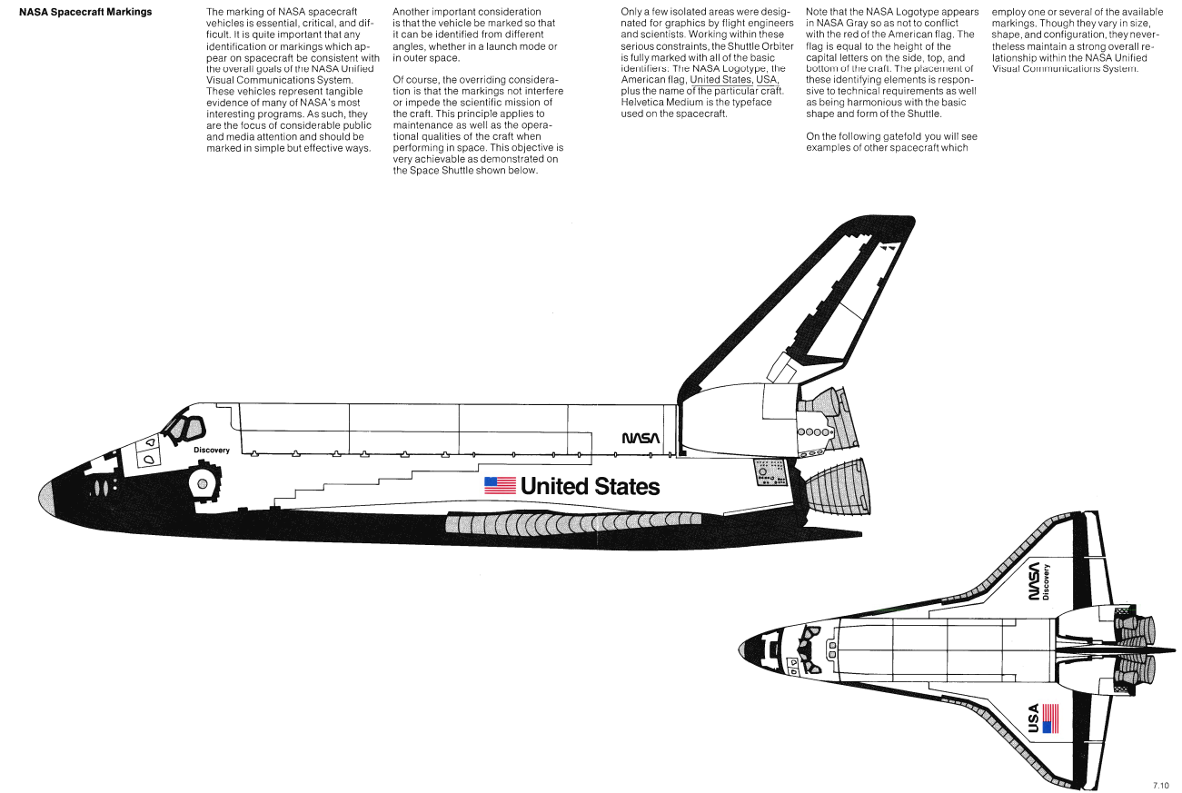
Nasa
Year: 1975, Author: Danne & Blackburn
The NASA Graphics Standards Manual by Richard Danne and Bruce Blackburn was a futuristic vision for the National aeronautics and space administration. Known as the NASA logotype, and nicknamed the ‘worm’, it was introduced in 1975 in an attempt to introduce a touch of modernity by replacing NASA’s circular blue, white and red insignia (aka the ‘meatball’).
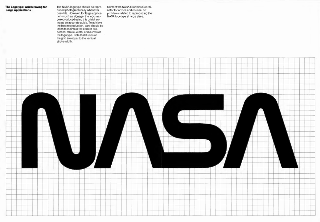
The manual goes into incredible detail in terms of the physical applications. It’s probably one of the few to include logo placement rules for a t-shirt as well as the space shuttle.
You can see the full manual in pdf or order a hardcover copy for $79.00.
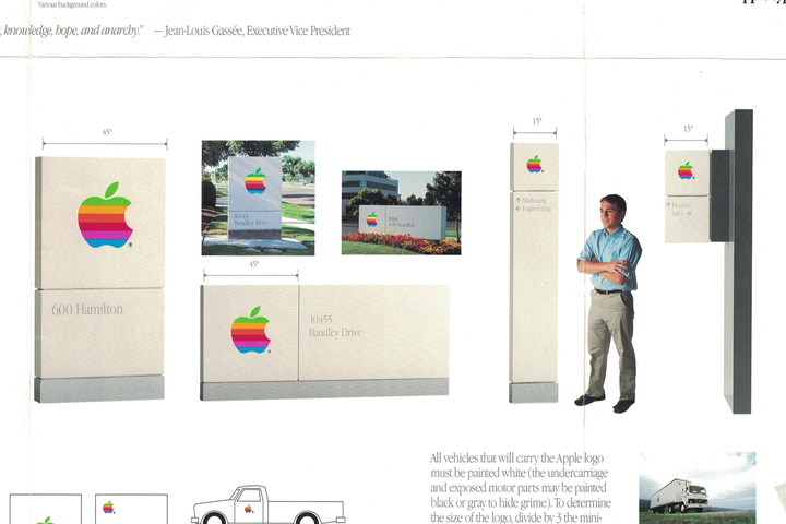
Apple
Year: 1977, Author: Rob Janoff
The original version of the Apple logo was designed by Rob Janoff in 1977. Rocking the playful rainbow colors and serif font, it’s quite far from the sleek cold look Apple adopted since. When searching for the brand guidelines document I was surprised it’s actually quite plain. It contains all the definitions for spacing, colors and typography but that’s about it.
However I came across this blog post which featured a foldable poster full of details about the Apple brand and its applications. It’s also really well written so be sure to check it out.

1972 Munich Olympics
Year: 1967, Author: Otto Aicher
In 1967 Aicher was commissioned to create a playful image for first Olympic games organized in Germany since the World war II. Inspired by the Bauhaus movement and its focus on use rather than aesthetics his work has set a new standards for branding and corporate design.
The brand guidelines contained a flexible system of colors, fonts and forms. That allowed Aicher’s team and partners to build to “play freely” and saved “unnecessary preparatory work and time-consuming detailed decisions”. Something that we now simply call a design system was quite a groundbreaking idea in 1967.

Sadly there is no complete digital version of this manual online. You can however buy it for $78.00.
1980 Moscow Olympics
Year: 1980, Author: Vladimir Arsentyev
Another example of a visual design guidelines for Olympic games. Just like Germany in 1972, Russia also needed to present itself as a modern forward looking country. Artistic freedom had to give to the state politics.

What caught my attention much more than the logo itself were these geometric icons for each discipline. All made using a simple system of 4 different sized circles and 11 by 11 grid.
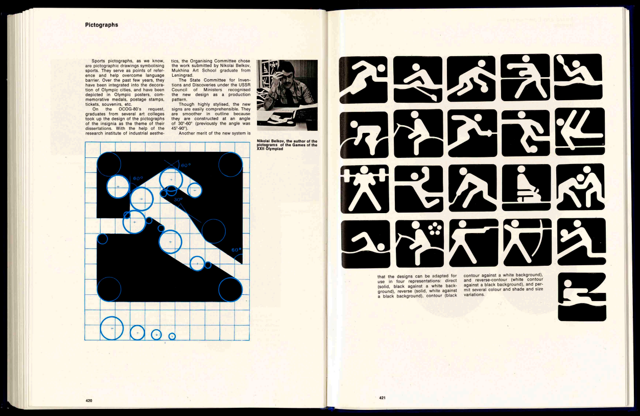
These image are not taken from the original style guide as it’s not available online but rather a book documenting the entire Olympics (scroll to page 9).
Next
Year: 1986, Author: Paul Rand
In 1986, Steve Jobs recruited renowned graphic designer Paul Rand to create a brand identity for Next – his ambitious venture after leaving Apple. The cost? $100,000 or an equivalent of roughly $250,000 today’s dollars. Next ultimately failed but the logo still remains somewhat iconic.
The original brand guidelines are hard to find but there is a simple logo spec sheet in the Paul Rand archive directory.
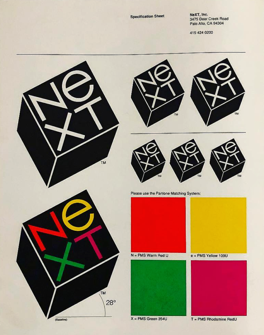
To persuade his clients that the proposed direction is indeed the right one Paul Rand produced a presentation book explaining his thought process. You should definitely go through it if you want to know more about his approach to graphic design and branding.
New York City Transit Authority
Year: 1970, Author: Massimo Vignelli and Bob Noorda, Unimark International
In 2013 someone found a copy of a first edition New York City Transit Authority Graphics Standards Manual in the basement of Pentagram‘s New York office. They decide to scan the entire book and make it accessible for all the other graphic design nerds. You can enjoy the high definition pdf here.

In case you would like to have a brand new copy in your living room you can buy it for $55.00.
Deutsche Bank
Year: 1978, Author: Anton Stankowski
A blue square with an oblique line, the company name written in simple sans serif font. Deutsche Bank’s logo is the epitome of modernist rationalism. Designed by Anton Stankowski it remains mostly unchanged to this day.
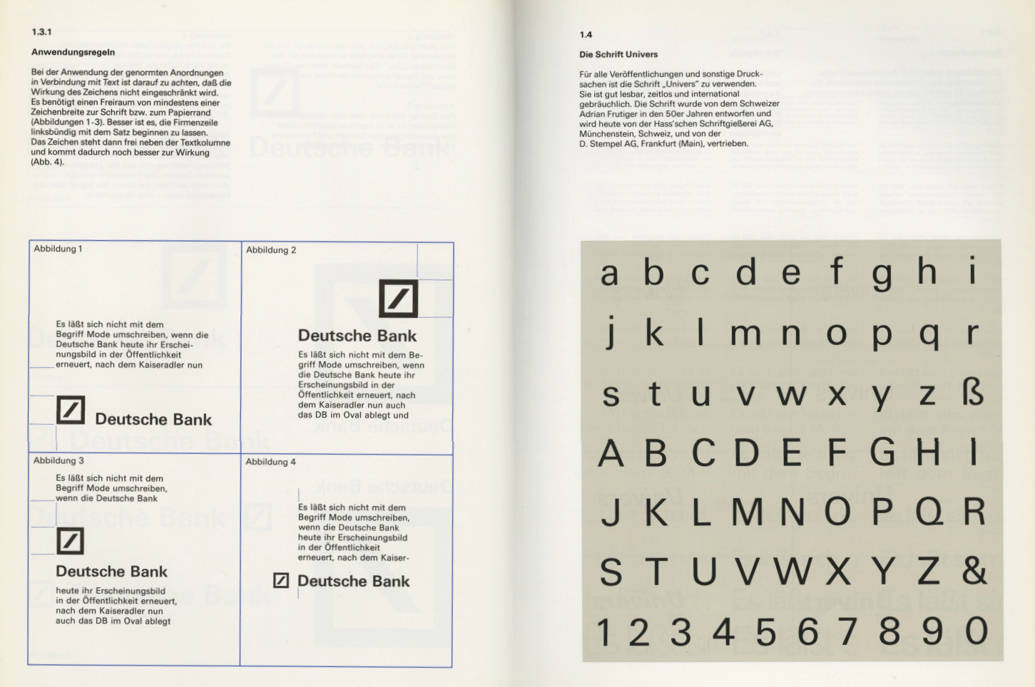
The brand manual however features much more diverse color palette than the dark blue we associate with Deutsche Bank today.
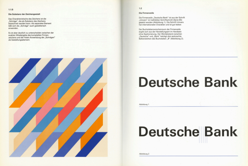
You can go through the full book online or learn more about the interesting history behind the Deutsche Bank brand.
IBM
Year: 1972, Author: Paul Rand
Paul Rand is probably most famous for his work on the “IBM Graphic Design Program”. The series of IBM logotypes created by Paul Rand culminated in 1972 in a drawn version made up of layered strips, making the company’s initials instantly recognisable all over the world.
The IBM graphic design guide is unfortunately nowhere to be found in a digital form but a nice Hardcover copy can be yours for $69.00.

Legacy Brand Books: A Golden Era of Visual Identity
Before brand style guides became standardized PDF downloads lost in a company’s shared drive, they were prized artifacts—brand books that were as much about storytelling as they were about technical rules. During the 60s, 70s, and 80s, these manuals weren’t just internal documents; they were design manifestos that revealed a brand’s philosophy, visual DNA, and creative ambition.
In an era before digital convenience, these printed guides were painstakingly crafted to showcase how every element—from a logo’s angle to the placement on uniforms or vehicles—fit into a larger identity system. These were not afterthoughts; they were foundational tools that informed how people experienced a brand in the real world.
Why These Manuals Still Matter
Unlike today’s often templated brand guides, historical brand books focused on intention over iteration. Designers like Paul Rand, Massimo Vignelli, and Anton Stankowski created visual identities that reflected clarity, boldness, and cultural relevance. These guides were deeply rooted in the principles of design—not trends, but truths.
At their core, they championed brand consistency. Every decision, from color codes to kerning, served a unified message. Whether applied on a billboard, brochure, or subway signage, the branding remained unmistakably aligned. This consistency helped build trust and familiarity—a foundation for long-term brand recognition.
The Art of Design Elements in Classic Brand Guides
What made these manuals timeless was their use of carefully considered design elements. From geometric grids to scalable icon systems, every component was designed to work across multiple platforms—long before the digital era demanded it. There was no reliance on stock visuals or one-size-fits-all templates. Instead, brands were represented through custom typography, curated color schemes, and original logos designed to stand the test of time.
Consider the striped IBM logo, NASA’s futuristic worm logotype, or the grid-based pictograms from the Moscow Olympics. Each of these was part of a larger brand style guide that ensured visuals weren’t just aesthetically pleasing—they were functional, universal, and strategic.
Use Cases Beyond the Corporate World
These historic brand books also had surprisingly broad use cases. Olympic design systems needed to be implemented by hundreds of teams around the globe, from signage in stadiums to printed materials for tourists. Transit systems, like New York City’s subway, relied on visual consistency to reduce confusion and streamline navigation for millions of riders. In these cases, a brand wasn’t just a business asset—it was a public utility.
Even retail brands like Apple in the late 70s used their brand guide not only to maintain visual identity, but also to build emotional connections with users through cohesive business cards, product packaging, and storefront signage.
Lessons for Modern Brands
Many modern companies rely on minimal brand guidelines—often just a folder of assets and a two-page PDF. But there’s a growing realization that brand elements need to evolve into something more dynamic and intentional. That’s where the legacy of these classic manuals offers inspiration.
A solid brand guide isn’t just about avoiding mistakes or placing the logo correctly. It’s about building a system that any designer, marketer, or partner can understand and apply—without diluting the brand. These early manuals show how clarity in documentation leads to creativity in execution.
Why This Still Inspires Design Culture Today
The reason these historical brand books are still collected, studied, and reprinted is because they encapsulate an era when design mattered at every level. They weren’t just technical—they were aspirational. They gave brands a voice, a shape, and a strategy.
For any brand looking to move from chaotic rebranding cycles to cohesive growth, revisiting these guides is more than nostalgia—it’s a masterclass in strategic identity building. When every design element is intentional, and every rule has a reason, the brand becomes more than a logo—it becomes a language.
Brand Guidelines Today
Today brands have to evolve much faster than in the 60s. Most marketing collateral is created for disposable experiments in-house. Having a 100 page manual on how to apply logo on a car is no longer relevant for most digital first companies.
At Brandy we are creating a new, more dynamic brand guidelines combined with a digital asset manager. Rather than just a list of rules we want everyone on your team to have access to the latest brand assets from their browser. You can learn more and sign up for early access here.