Every great logo tells a story, but not every story is immediately visible. Behind the clean lines and clever typography of the world’s most famous logos lies a layer of hidden meaning that few notice at first glance. These subtle visual tricks are what turn simple designs into powerful brand symbols that stick in our minds. From arrows tucked into letters to secret symbols woven into shapes, designers use hidden elements to connect emotion, story, and purpose.
In this article, we uncover ten of the most iconic logos that have more to say than meets the eye. Each one reveals how thoughtful design can make a brand unforgettable and show why a great logo is much more than just a pretty mark.
Why Brands Hide Meaning Inside Logos
A logo does more than identify a brand. It represents an idea, a promise, and the emotions a company wants people to feel. When designers include hidden meanings in logos, they give these visuals an extra layer of personality. It is not just about aesthetics; it is about storytelling.
Hidden meanings, often called Easter eggs, create intrigue. When people discover them, they feel a small moment of satisfaction, like solving a puzzle. That emotional connection makes the logo easier to remember and the brand more relatable. For example, a hidden arrow, smile, or symbol can subtly reinforce a brand’s core message without needing extra words.
These visual secrets also encourage word of mouth. When someone points out a hidden meaning in a logo, it spreads curiosity and boosts brand recognition naturally. In short, the best logos work on two levels: immediately recognizable and rich with a deeper story waiting to be discovered.
How We Chose the Ten Examples
Every logo tells a story, but only a few stand out for their clever design and layered symbolism. To create this list, we selected ten world-famous logos that go beyond surface beauty. Each was chosen for its creativity, relevance, and the way it communicates a brand’s essence through visual cues.
We focused on logos that have a story hidden in plain sight designs that reveal something new when you look closer. From multinational giants to lifestyle icons, these examples showcase how thoughtful design can transform a simple image into a symbol filled with meaning and purpose.
The Best Logos with Hidden Meanings
Some logos do more than just look good; they tell a hidden story. These designs prove that simplicity and symbolism can coexist beautifully when creativity meets purpose. Below are ten famous logos that carry deeper meanings cleverly embedded within their shapes, colors, and letters. Each one shows how thoughtful design choices can make a logo not only recognizable but unforgettable.
FedEx
The FedEx logo may look simple at first glance, but hidden between the letters “E” and “X” lies a white arrow. This subtle detail represents precision, speed, and forward movement, the essence of FedEx’s reliable shipping service. The clever use of negative space makes it both functional and symbolic, showing how design can express a company’s core values without saying a word. Every time someone spots the arrow for the first time, they instantly remember the logo and the brand’s promise of fast delivery.
Takeaway: Negative space can create powerful symbolism when used purposefully.
Amazon
Amazon’s logo is more than just a friendly smile. The curved arrow connects the “A” to the “Z,” symbolizing that Amazon sells everything from A to Z. The arrow also doubles as a smile, suggesting customer satisfaction and a pleasant shopping experience. This simple yet meaningful design communicates variety, reliability, and happiness all in one glance, making it one of the most recognizable logos in the world.
Takeaway: A logo that reflects a brand promise builds trust and recognition.
Toblerone
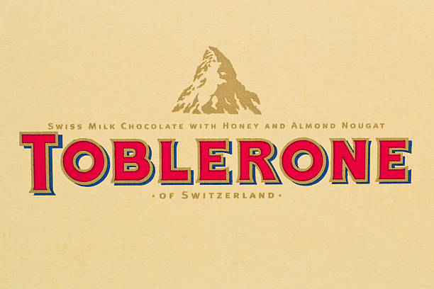
The famous Swiss chocolate Toblerone hides a bear inside the mountain on its logo; a tribute to the city of Bern, known as the “City of Bears.” The image combines heritage and creativity, showing how local identity can be woven into global branding. The bear also symbolizes strength and sweetness, perfectly aligning with Toblerone’s premium image and distinctive triangular chocolate shape.
Takeaway: Tying local roots to brand storytelling can create emotional depth.
Baskin Robbins
The playful “BR” in the Baskin Robbins logo cleverly conceals the number 31 in pink, representing its original 31 ice cream flavors. This fun design reminds customers of variety and indulgence. The hidden number evokes nostalgia for the brand’s long history while still feeling modern, reflecting how Baskin Robbins continues to innovate while honoring its roots.
Takeaway: Embedding product truth inside your logo keeps the brand memorable.
NBC
The colorful peacock logo of NBC symbolizes pride in broadcasting and innovation. The feathers represent the network’s broad range of programming, while the hidden peacock facing right signifies looking forward, not back. The vibrant color palette was also designed to celebrate the arrival of color television, reinforcing NBC’s pioneering spirit in media evolution.
Takeaway: Motion and direction in logo design can subtly express progress.
Sony Vaio
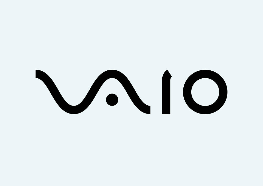
Sony Vaio’s logo combines technology and creativity beautifully. The letters “V” and “A” form an analog wave, while “I” and “O” symbolize digital binary code. Together, they bridge the analog and digital worlds, reflecting Sony’s innovation in technology. The design perfectly captures the brand’s vision of blending traditional craftsmanship with modern digital precision.
Takeaway: A logo can connect the past and future through thoughtful symbolism.
Tour de France
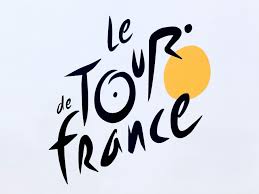
At first glance, the Tour de France logo looks like stylized text. But look closer, and you’ll see a cyclist formed by the letters “R” and “O,” with the yellow circle representing the front wheel. It perfectly captures the energy, motion, and joy of the world’s most famous cycling race. The logo’s clever execution ensures it’s not only a wordmark but also a lively visual story of endurance and passion.
Takeaway: Letterforms can double as imagery when creativity leads the design.
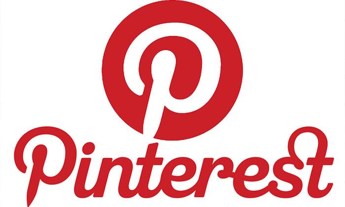
Pinterest’s logo includes a “P” shaped like a push pin, symbolizing the act of pinning ideas, which is the platform’s central purpose. This visual connection between name and function makes the logo instantly relatable and intuitive. The minimalist style allows it to stay recognizable even in small app icons, proving that simplicity and meaning can coexist in perfect balance.
Takeaway: Visual cues linked to the product experience increase brand recall.
Unilever
Unilever’s “U” is composed of tiny icons representing its diverse range of products—from food and beverages to skincare. Each element contributes to the overall story of a company that touches many aspects of daily life. The detail-rich design shows how a single logo can tell an entire brand story, celebrating Unilever’s values of sustainability, quality, and care for people and the planet.
Takeaway: Visual storytelling within a logo can communicate scale and diversity.
Adidas
Adidas’s three diagonal stripes form the shape of a mountain, symbolizing the challenges athletes face and the determination to overcome them. It turns a simple geometric design into a motivational symbol. The brand’s long-term consistency with these stripes has made them iconic, instantly recognizable even without the brand name, representing progress and perseverance for generations of athletes.
Takeaway: A strong metaphor can make even minimalist designs deeply meaningful.
Design Patterns Behind Hidden Meanings
Hidden meanings in logos often follow clever visual principles that make them memorable and unique. One of the most common is negative space, where unseen shapes appear between or inside letters, like the arrow in FedEx. Letterform fusion is another favorite, blending characters to form new images or symbols, as seen in Tour de France or Sony Vaio.
Some designers use numerical reveals, embedding numbers to communicate product variety or heritage, just like Baskin Robbins’ “31.” Others incorporate motion cues or cultural references that reflect their story, such as NBC’s forward-looking peacock or Toblerone’s nod to its Swiss origin.
These design patterns aren’t accidental; they are intentional storytelling tools. They turn logos from static symbols into experiences, making them more engaging and meaningful for audiences across generations.
How to Craft a Hidden Meaning in Your Own Logo
Designing a logo with hidden meaning starts with understanding your brand’s core message. Think about what emotion or story you want to communicate – speed, trust, creativity, or innovation. Then explore symbols or metaphors that naturally represent those qualities. Sketch multiple ideas and look for opportunities to use negative space or integrate shapes within letters, as many famous logos do.
It is important to keep the design clean and simple. A hidden meaning should enhance recognition, not confuse it. Test your design with people unfamiliar with your brand and see if they notice the subtle detail or if it feels forced.
Finally, document the story behind your logo in your brand guidelines to ensure consistent use across platforms. That story is what turns your logo from a design element into a timeless piece of brand identity that resonates with every audience.
How Brandy Helps Preserve Your Logo Story
Your logo’s meaning deserves to stay consistent no matter who uses it. With Brandy, you can store every version of your logo, define usage rules, and share the story behind its design in one secure space. Teams can access approved logo files, colors, and brand guidelines instantly, keeping your visual identity strong and unified.
By centralizing your brand elements in Brandy, you ensure that the hidden meaning behind your logo remains clear, consistent, and protected across every touchpoint.
Conclusion
The world’s most famous logos prove that great design goes beyond looks. Each one holds a hidden story that connects people to the brand on an emotional level. Whether it is an arrow, an animal, or a mountain, these subtle details make us pause, notice, and remember.
A logo with hidden meaning not only attracts attention but also builds a lasting bond with its audience. It is a small design choice that delivers a big impact, turning ordinary visuals into unforgettable brand symbols that stand the test of time.