
Design systems have become the backbone of modern product design and development. They give teams a shared language, a set of reusable components, and clear usage guidelines that keep every digital product consistent, accessible, and on brand. Whether you are designing an app, a website, or a full suite of digital products, a strong design system ensures that every interaction feels familiar to users and aligned with your brand values.
Instead of starting from scratch for every new project, design systems act as a single source of truth. They combine visual elements like color palettes, typography, and icons with coded components, design tokens, and detailed guidance on how to use them. This structure allows designers and developers to work faster, maintain quality, and reduce costly inconsistencies in the user experience.
Top companies such as Apple, Google, Atlassian, IBM, and Pinterest have built their own design systems to scale efficiently while preserving their unique design language. These systems are not just libraries of UI kits or component libraries; they are comprehensive toolkits that include style guides, code snippets, web components, and well-documented design patterns. Studying these system examples can give your design and development teams a strong foundation to create consistent, user-friendly experiences that meet both business goals and user needs.
In this guide, we will explore some of the best design system examples, highlight their key features, and share what makes them so effective. By the end, you will have a clearer idea of how to use these insights to build or refine your own design system.
Why Design Systems Are a Game-Changer for Teams
A well-structured design system is more than a collection of UI components and style guides. It is a practical framework that empowers design and development teams to work together efficiently, regardless of their location or role in the product lifecycle. By using predefined design elements, code snippets, and design tokens, teams can ensure consistency across all digital products while reducing repetitive work.
One of the main advantages is speed. With reusable components ready to go, designers can create high-fidelity prototypes in less time, and developers can implement them without guessing at design decisions. This eliminates the constant back-and-forth that often slows the design and development process.
Design systems also promote a shared language between designers, developers, product managers, and content designers. Everyone works from the same set of usage guidelines, which helps ensure consistency in both visual design and functionality. This shared foundation means that updates to UI elements, dark mode settings, or accessibility features can be rolled out across products with minimal effort.
For growing brands, a design system scales effortlessly. Whether you are supporting sub brands, creating a web design system for multiple markets, or building complex enterprise tools, the system keeps every product aligned with brand values. This scalability not only saves time but also improves the overall quality of user-friendly experiences delivered to your audience.
Key Elements That Make a Strong Design System
Every successful design system is built on a foundation of well-defined components, clear documentation, and a consistent visual language. These basic building blocks work together to create a unified experience across all products, making it easier for design and development teams to collaborate.
1. Reusable Components
These are the heart of any system. Buttons, forms, navigation bars, and other UI elements are designed once, coded, and stored so they can be used repeatedly in different products. This approach not only saves time but also ensures that every interface feels consistent.
2. Style Guides
A good design system includes detailed style guides that cover typography, color palettes, iconography, spacing, and imagery. These guidelines help maintain a cohesive brand identity across multiple platforms.
3. Design Patterns
Patterns are tried-and-tested solutions for common design problems. From form layouts to card structures, having these in place helps teams create consistent and user-friendly experiences without reinventing the wheel each time.
4. Design Tokens
Design tokens store design decisions such as colors, spacing, shadows, and transitions in a format that can be used by both designers and developers. This ensures that design changes can be applied across the entire system quickly and accurately.
5. UI Kits
Many design systems include downloadable UI kits for tools like Figma or Sketch. These kits provide ready-made components and templates, making it easy for designers to start a project without building every asset from scratch.
6. Usage Guidelines and Documentation
Clear usage guidelines are essential to help teams understand when and how to use each component. Including code examples, visual examples, and accessibility standards in your documentation ensures that the system is easy to adopt and maintain.
Best Design System Examples to Learn From
Studying real-world design system examples can help you understand how the best brands structure their components, maintain brand values, and ensure consistency across all digital products. Below are some of the most influential systems, each with its own strengths and lessons to take away.
Apple Human Interface Guidelines

Apple’s Human Interface Guidelines are one of the most recognized design systems in the world. They provide platform-specific design resources for iOS, macOS, watchOS, and tvOS, ensuring that every product delivers a seamless and accessible experience.
Key Features:
- Detailed design guidelines for each Apple platform
- Reusable components and patterns with visual examples
- Strong emphasis on accessibility and inclusion
- Downloadable UI kits for faster design work
Why It Stands Out:
The system reflects Apple’s design principles of simplicity, precision, and focus on user needs. It includes guidance for everything from buttons and menus to dark mode adaptation, ensuring developers and designers can create consistent, user-friendly experiences.
Google Material Design

Material Design is Google’s open source design system that blends design principles with technical implementation. It’s widely used across apps, websites, and other platforms, offering a strong foundation for teams building their own design system.
Key Features:
- Extensive library of components and UI patterns
- Material Theming for brand customization
- Comprehensive style guides for color, typography, and motion
- Design tokens for consistent implementation across products
Why It Stands Out:
It gives designers and developers a strong foundation for scalable design while allowing brands to adapt the look and feel to suit their identity. The availability of code examples and open source nature makes it a go-to for many teams.
Atlassian Design System

The Atlassian Design System focuses on improving collaboration for global teams using tools like Jira and Trello. It provides clear usage guidelines for both visual design and content strategy.
Key Features:
- UI components with detailed guidance and code snippets
- Content guidelines for voice, tone, and inclusive language
- Design tokens for quick updates across platforms
- Brand values integrated into every design decision
Why It Stands Out:
It bridges the gap between design and development teams by including both functional UI elements and content design best practices. This ensures products are not only visually consistent but also align with Atlassian’s brand personality.
IBM Carbon Design System

Carbon is IBM’s open source design system, created for enterprise-grade scalability. It supports designers and developers with a full range of tools for building complex digital products.
Key Features:
- Data visualization patterns and reusable components
- Accessibility-first design principles
- Web components for highly customizable solutions
- UI kits for design tools like Sketch and Figma
Why It Stands Out:
Its open source nature allows other brands to adapt it to their needs while benefiting from IBM’s robust design framework. The system ensures consistency across IBM’s sub brands and large-scale projects.
Shopify Polaris

Polaris is Shopify’s design system, built to create consistent, accessible experiences for eCommerce merchants worldwide.
Key Features:
- Reusable UI components for commerce-specific needs
- Guidelines for accessibility and interaction states
- Design tokens for colors, typography, and spacing
- Clear usage guidelines for both designers and developers
Why It Stands Out:
It addresses the unique challenges of digital commerce, allowing designers and developers to create scalable, user-friendly experiences that align with Shopify’s brand values.
Salesforce Lightning Design System

The Lightning Design System is designed to help teams create consistent, high-quality user interfaces for Salesforce products.
Key Features:
- UI components with code examples for quick development
- Detailed design tokens for easy updates
- Accessibility guidelines and dark mode support
- Style guides for brand consistency
Why It Stands Out:
It is tailored for complex CRM environments, ensuring that even with a wide range of products, the brand experience remains unified and accessible.
Pinterest Design System – Gestalt
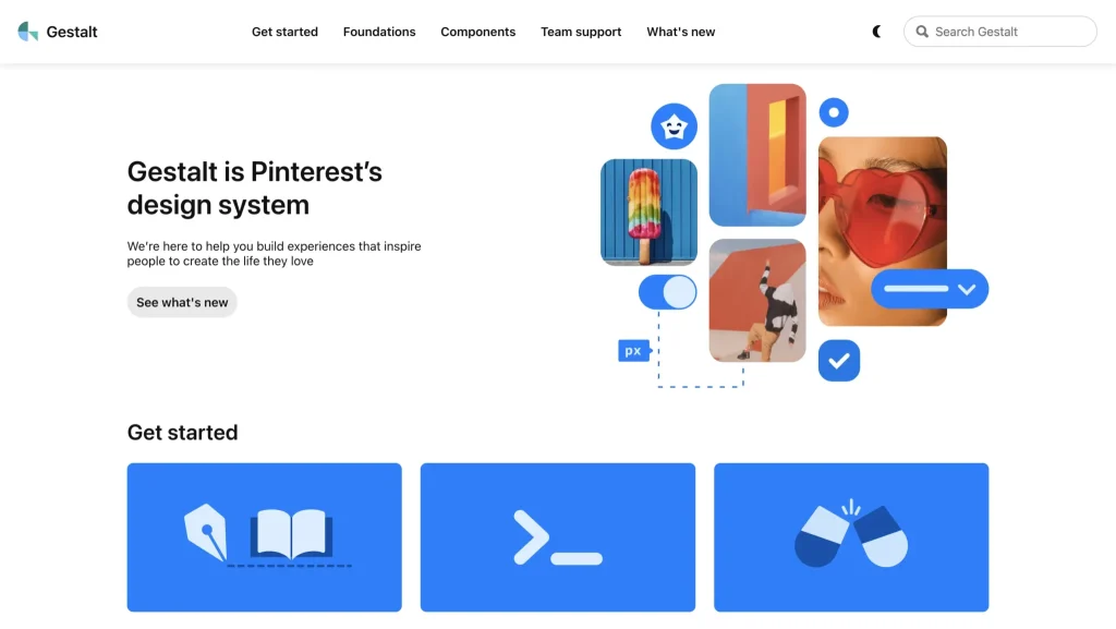
Gestalt is Pinterest’s design system, focused on delivering visually rich and personalized experiences for its global audience.
Key Features:
- Components optimized for web, iOS, and Android
- Accessibility and responsiveness as core principles
- Roadmap and contribution process for transparency
- Design patterns aligned with Pinterest’s creative brand language
Why It Stands Out:
Its visual-first approach makes it ideal for brands where aesthetics are as important as functionality, while still maintaining strong accessibility standards.
Adobe Spectrum

Spectrum is Adobe’s comprehensive toolkit for creating consistent experiences across its creative suite.
Key Features:
- UI components for creative tools and web applications
- Design tokens for scalable theming
- Guidelines for dark mode and accessibility
- Highly customizable design elements for brand adaptation
Why It Stands Out:
Spectrum balances consistency with flexibility, allowing different Adobe products to maintain their own identity while feeling like part of a larger family.
Mailchimp Design System

Mailchimp’s design system reflects its playful yet professional brand personality, with a focus on small business needs.
Key Features:
- Components and patterns for marketing-focused products
- Style guides for typography, color, and illustration
- Design tokens for quick updates to brand elements
- UI kits for rapid prototyping
Why It Stands Out:
Its brand personality comes through in every component, making it a great example of how design systems can also express character and tone.
Capital One Design System

Capital One’s design system supports a wide range of financial products, focusing on secure and accessible digital experiences.
Key Features:
- Components tailored to financial user needs
- Accessibility and security-first design principles
- Detailed guidance for multi-platform consistency
- UI patterns that streamline financial workflows
Why It Stands Out:
It shows how design systems can address industry-specific needs while still maintaining broad usability and brand alignment.
Final Thoughts
The design system examples we explored, from Apple Human Interface Guidelines to the Pinterest Design System, show how a well-crafted framework can transform the way design and development teams work. Each of these systems offers more than components or style guides; they provide a comprehensive toolkit that ensures consistency, speeds up the design and development process, and supports brand values at every stage.
Whether you are creating your own design system from scratch or refining an existing one, the lessons from these industry leaders can guide you toward a scalable, user-friendly experience. Focus on building reusable components, maintaining detailed documentation, and ensuring accessibility for all users. When you combine these basic building blocks with a clear design language, your system becomes a shared resource that benefits designers, developers, product managers, and ultimately, your end users.
A strong design system is not static. It grows alongside your products, adapts to new technologies, and continues to meet evolving user needs. By applying these insights, you can create consistent, high-quality digital products that stand out in any market.